[ UNDER/CONSTRUCTION ] - LAST UPDATED: 23.06.2026

Working at Zinus allowed me to dive deep into several exciting projects. We revamped the e-commerce experience to make it not just user-friendly but truly engaging. From the website's redesign to refreshing marketing strategies and packaging, we made things more efficient, cutting down on project time by 20% and boosting sales.
2019 - 2024


TYPOGRAPHY
Upon joining Zinus, I identified brand inconsistency resulting from vague typography guidelines. I addressed this by designing a comprehensive typography system built on three core principles: establishing a modular type scale, defining clear typesetting rules, and developing a systematic heading hierarchy. This foundational system became a cornerstone of the brand identity. It empowered teams with clear standards, streamlined the design process across all channels, and ultimately ensured consistent typographic application that reinforced the Zinus brand expression.

COLOR
To address Zinus's inflexible and inaccessible color palette, I researched cross-platform needs and implemented a revamped system. This involved expanding the primary green with contrast variants, splitting secondary palettes for versatility, adding dedicated neutrals for accessibility, and defining clear usage rules. The result is a harmonious and functional system that empowers teams to maintain brand aesthetics while consistently meeting accessibility standards.
ICONOGRAPHY
Addressing Zinus's outdated and inconsistent icon library, which lacked clear guidelines and hindered implementation, I spearheaded a complete overhaul to create a scalable and aesthetically aligned system. This involved defining a simplified, legible iconic style (geometric, flat, weighted strokes), establishing precise construction principles (grid, stroke weights, corners, detail levels), and strategically expanding the library to over 100 versatile icons based on an audit of needs. The resulting comprehensive icon library now serves as a cornerstone of the Zinus design system, ensuring consistency and scalability while empowering cross-functional teams with clear standards and a robust suite of branded icons.

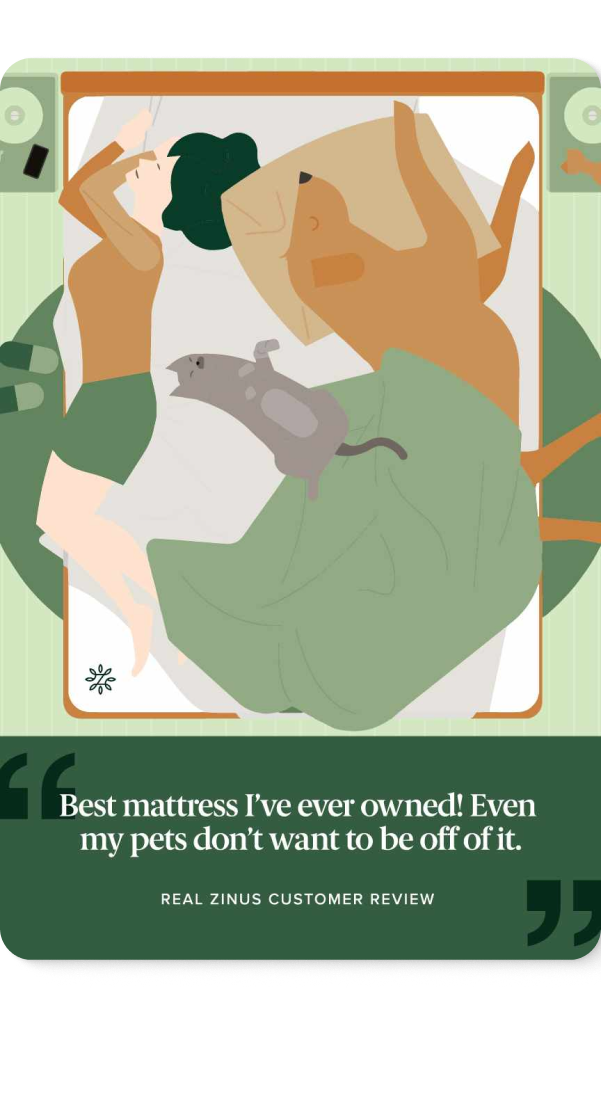
ILLUSTRATIONS
To rectify inconsistencies in Zinus's illustration usage, which lacked defined standards despite existing photo and graphic guidelines, I established a comprehensive framework. This involved curating an exclusive illustration palette derived from brand colors, defining purposeful color ratios (accent vs. predominant), and standardizing techniques like line weight, detail levels, and finishes. These clear guidelines have resulted in a cohesive and recognizable illustration style that reflects Zinus's friendly personality, empowering teams to create on-brand visuals confidently and reinforcing the brand's meticulous attention to detail.